The Best Colour Schemes for a Minimalist Aesthetic
The minimalist home design focuses on simplicity, functionality, and elegance. A key part of this style is the colour palette. The best colours for minimalism create space, tranquillity, and harmony while maintaining a timeless appeal.
A well-chosen colour scheme can transform any space into a serene, balanced environment. The right colours make a room feel larger, inviting, and cohesive, leading to a stress-free living experience. Plus, minimalist colours are versatile, adapting as your design preferences change.
This guide explores the best minimalist colour schemes, how to use them at home, and tips for balancing beauty with function.
Why a Minimalist Colour Palette Matters
A carefully chosen colour scheme is vital for a minimalist home. Here’s why:
- Creates a sense of space: Light, neutral tones make rooms feel larger and airier.
- Enhances tranquillity: Muted shades promote calm and peace.
- Maintains visual consistency: A cohesive palette ensures a clean look.
- Timeless appeal: Neutral decor transcends trends, ensuring lasting design.
- Versatility: Minimalist colours complement various furniture styles and materials.
The Best Colour Schemes for Minimalist Homes
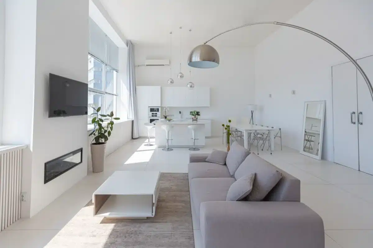
Classic White and Off-White
Best for: Brightening spaces and enhancing natural light.
- White is the ultimate minimalist colour, offering a clean, airy feel.
- Off-white tones like ivory or cream add warmth without overwhelming.
- Perfect for Scandinavian and modern minimalist interiors.
How to use:
- Paint the walls white for an open look.
- Pair with natural textures like wood and linen.
- Use white furniture with black or grey accents.
- Combine with soft lighting to avoid sterility.
Soft Grey and Charcoal
Best for: Adding depth while keeping a neutral vibe.
- Grey provides a sophisticated look that pairs well with neutrals.
- Charcoal creates a bold contrast without overpowering.
- Ideal for contemporary and industrial designs.
How to use:
- Use light grey for walls and upholstery.
- Incorporate darker grey accents in furniture and textiles.
- Use warm lighting to avoid a cold feel.
- Mix in wood or brass elements for warmth.
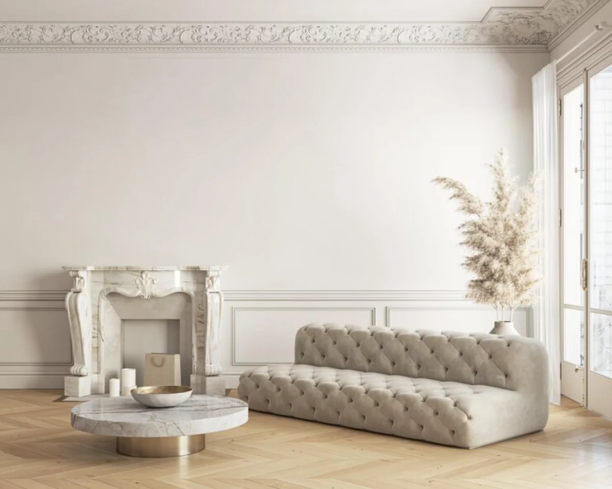
Earthy Beige and Warm Taupe
Best for: Creating a cosy, natural minimalist home.
- Beige and taupe add warmth while keeping the decor simple.
- These tones pair nicely with wood, linen, and organic materials.
- It is great for modern, Scandinavian, and Japanese wabi-sabi styles.
How to use:
- Choose beige or taupe walls for a warm space.
- Use wooden furniture and woven textures for depth.
- Layer different shades for a refined monochromatic look.
- Combine with soft whites and greys for balance.
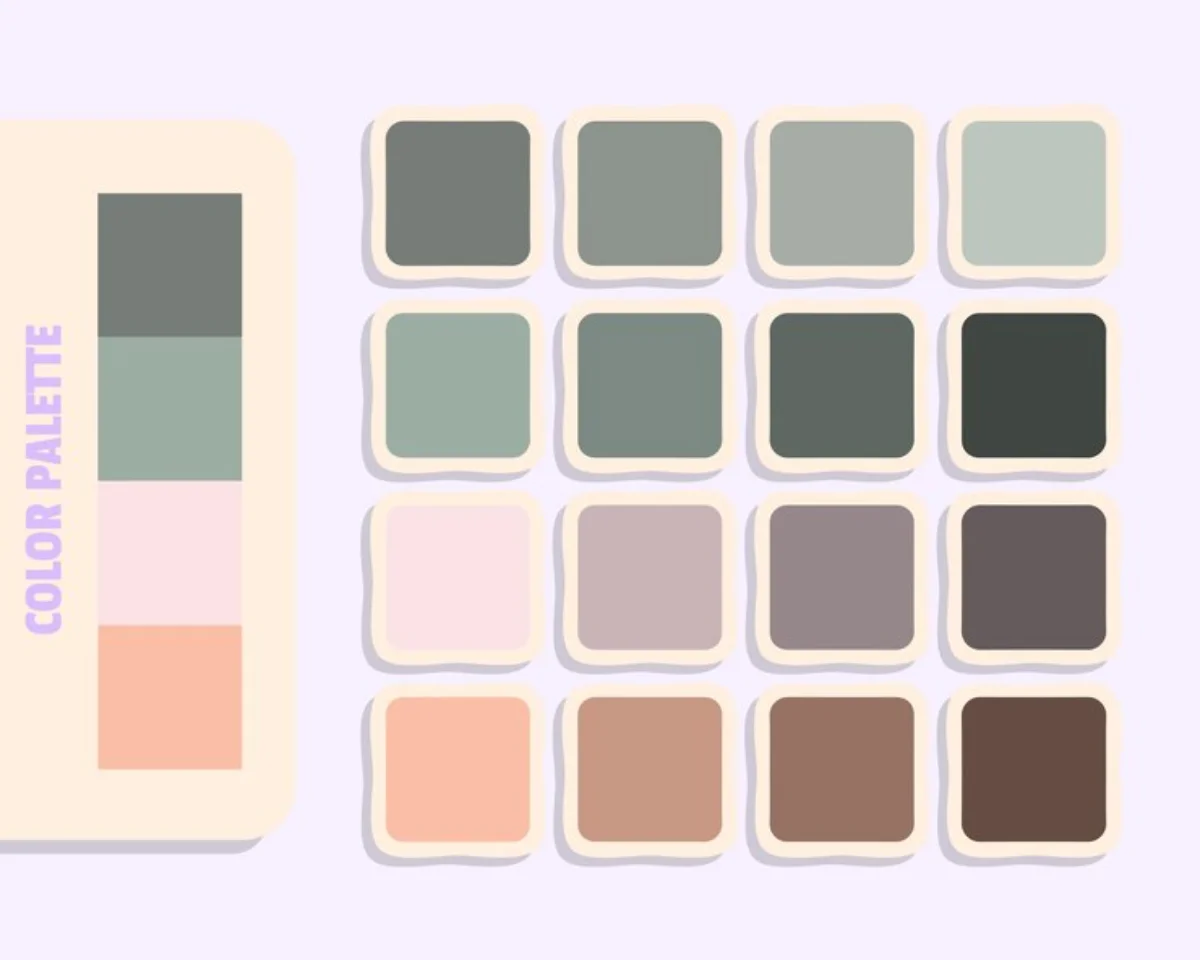
Muted Pastels
Best for: Adding soft colour variations to minimalist spaces.
- Pastel shades like blush pink and sage green keep things subtle.
- These hues work well in Scandinavian and contemporary interiors.
How to use:
- Use pastel textiles like throws and cushions.
- Add pastel ceramics to break up neutrals.
- Keep walls and large furniture neutral while using pastels as accents.
- Mix pastels with wood for an organic feel.
Monochrome Black and White
Best for: Achieving a sleek, high-contrast look.
- The black-and-white mix is bold yet timeless.
- It creates a striking, uncluttered appearance when balanced.
- Common in modern and ultra-minimalist homes.
How to use:
- Use a white base with black accents in the decor.
- Incorporate geometric patterns for visual interest.
- Opt for black-framed windows for strong features.
- Balance with wood to soften contrasts.
Greige (Grey + Beige)
Best for: Blending cool and warm neutrals.
- Greige combines beige’s warmth with grey’s sophistication.
- It offers versatility for various minimalist styles.
How to use:
- Use greige for walls to create a soft backdrop.
- Pair with wood and stone for a natural feel.
- Add soft white accents for brightness.
- Introduce gold or brass for subtle elegance.

Tips for Implementing a Minimalist Colour Palette
- Stick to a limited palette: Aim for 2-3 core colours with slight variations.
- Prioritise natural light: Light shades enhance brightness, making spaces feel open.
- Incorporate texture: Mix materials like linen, wood, and stone to add depth.
- Use colour strategically: Introduce darker tones in accents for contrast.
- Avoid excessive patterns: Stick to simple designs to maintain minimalism.
- Experiment with undertones: Choose warm or cool shades based on lighting.
- Use matte finishes: Avoid glossy surfaces for a softer look.
Common Mistakes to Avoid
- Overloading with white: Too much white can make a space feel sterile.
- Neglecting warmth: Add beige, wood, or warm greys to avoid a cold look.
- Ignoring undertones: Consider warm or cool undertones for harmony.
- Skipping contrast: Balance light and dark elements to avoid monotony.
- Using too many bold accents: Keep accent colours muted to maintain minimalism.
- Not considering furniture materials: Ensure colours complement textures in the space.
Timeless Colour Schemes for a Minimalist Space
The right minimalist colour scheme balances simplicity, elegance, and warmth. Whether you choose classic neutrals, earthy tones, or soft pastels, the right colours can make your home serene.
A thoughtful, minimalist colour scheme should feel intentional, calming, and harmonious. By selecting the proper shades and balancing textures, you can create a home that is visually pleasing, timeless, and elegant.
Ready to refresh your home with a minimalist colour palette? Start small by adding neutral decor and gradually building a cohesive, timeless look.


